Thursday, May 1, 2014

Contemporary Designer


Karl Lagerfeld


karl-lagerfeld-chanel

Italian fashion designer, artist and photographer Karl Lagerfeld was born in Hamburg, Germany on the 10th of September in 1933. He had been called to give new life to Chanel. Apart from being the head designer and creative director of Chanel, he also is the creative director of Fendi.


His works for Chanel

Chanel Spring-Summer 2014 Haute Couture

In his Spring-Summer 2014 Haute Couture collection, he created a whole look with sneakers, long dresses and short jackets. He got his idea from around the 1800-1840 due to the fact that in that period women used to wear flat shoes even with ball gowns. He said that "it gives a new, modern attitude to couture. The flexibility between the skirt, the top and the waist means you can move. It is not one stiff piece. Then it would be de`mode`." In this collection he makes use of bright colours which create a both elegant and sporty look due to the sneakers. I like the way how he is using sneakers to create such a new stylish look. The sneakers also create that comfortable feeling. It is also original because normally women wear heels with dresses and skirts.


Chanel Couture SS14


Chanel Fall-Winter 2014-15 Ready To Wear Collection

The fashion show was held in the Chanel Shopping Center where it had the imagery of everyday luxury and pop art. Karl Lagerfeld's collection had a modern and urban vibe. There was also the use of sneakers which were combined with blazers, coats and dresses. The collection is full of richness of fabrics and colours, silhouettes and lively looks. He also makes use of contrasting tones geometrical prints of early 20th Century avant-garde art. There is also a use of tweed which was featured in coats. Blazers were used to show waistlines which were noticeable by modern zipped corsets. There is also use of accessories such as  tweed sunglasses, small purses, chain necklaces with tweed or metal padlocks which are stamped with the double c logo of chanel and cascades of pearls knotted around the neck to give an impression of a scarf. This collection is full of nice, bright and interesting colours which overall they create an awesome look and style. Lagerfeld's use of different fabrics, colours, textures, shapes and silhouettes are creating such an interesting composition. 


The Barcode of the collection


His works for Fendi

Fendi Spring-Summer 2014 Collection

In his collection he used one of his favourite fabric which is known as organza. The organza was laser cut and it was layered in different spectrums of colour. He said that it was inspired "by light passing through water." "Hyperlinking" was one of his keys to the quality of the collection for example how the leather jacket was carved created a reason for skirts. Fendi's collection is the most comfortable and luxurious and he makes use of amazing light fabrics. Lagerfeld also makes use of fur in his dresses, skirts, tops and coats. He also makes a touch of laser cutting in his fur jackets and skirts. Karl Lagerfeld says that his collection is "inspired by the world of informatics." In his collection he makes a use of contrast. I like the fact that he adds a touch of bright colour when there is black and white.


Bibliography:

Websites:


Bio., 2014. Karl Lagerfeld Biography. [online]
Available at: http://www.biography.com/people/karl-lagerfeld-9371367#awesm=~oHuimU5quSmFij [Accessed 1st May 2014]

Its all style to me, 2014. Chanel Haute Couture Spring Summer 2014. [online]
Available at : http://itsallstyletome.com/2014/01/21/chanel-haute-couture-spring-summer-2014/ [Accessed 1st May 2014]

Chanel News, 2014. THE BARCODE OF THE COLLECTION. [online]
Available at: http://chanel-news.chanel.com/en/home/2014/03/the-barcode-of-the-collection.html [Accessed 1st May 2014]

Chanel. THE LOOKS. [online] Available at
http://www.chanel.com/en_WW/fashion/collections/show-fall-winter-2014-15/the-looks.html [Accessed 1st May 2014]

STYLE.COM. SPRING 2014 READY-TO-WEAR Fendi. [online] Available at :http://www.style.com/fashionshows/complete/slideshow/S2014RTW-FENDI/#1 [Accessed 1st May 2014]

History of Art


Fauvism

It is the first modern art movement which emerged in 1905. Henri Matisse, Maurice de Vlaminck and Andre` Derain were known as the best Fauve artists. Their art is full of characteristics such as bright, pure and unnaturalistic colours, dynamic and short brushstrokes, bold outlines, flatness, simplification, dynamism in nature, large areas of colour and there was also given a huge importance to the human figure.


Henri Matisse
Odalisque in Red Trousers


Henri Matisse - Odalisque in Red Trousers

I like the use of contrast and detail in this work. It has different types of patterns and colour schemes which seem to make an interesting composition. 


Maurice de Vlaminck
Houses at Chatou


Houses at Chatou, Oil by Maurice De Vlaminck (1876-1958, France)

This work shows a typical windy day due to the branches, the texture of the clouds and the kind of movement which is created on the ground. The texture of this work helps you realize its movements and details. It has a sense of contrast due to the difference of colours used in the upper part of the work and the lower part.


Andre` Derain
Charing Cross Bridge


Charing Cross Bridge, Oil On Canvas by André Derain (1880-1954, France)

I like how the artist is using different schemes of blue, yellow, green and red only. He is creating an amazing effect due to the use of same colours. It is high in contrast and its composition is totally contrastable.


Fauvism Nowadays
Life Boat by Jason B


Its colour schemes are like those which are seen in the works of the Fauve artists. I like the use of black and white with bright colours due to the fact that it creates a contrast and that the bright colours are bringing out the details of the painted women in black and white.


Bibliography


Notes taken during the lesson
http://www.ngv.vic.gov.au/orangerie/matisseimage.html
http://en.wahooart.com/@@/7ZCTC4-Maurice-De-Vlaminck-Houses-at-Chatou
http://en.wahooart.com/@@/8CAAZ4-Andr%C3%A9-Derain-Charing-Cross-Bridge
https://www.flickr.com/photos/13282622@N06/1361757838/in/pool-68021489@N00/


Saturday, April 26, 2014

History of Design


Constructivism

It was a Radical Russian art and architecture movement which started before the Bolshevik Revolution (1917-1935) which origins in Russia. Their aim was to contribute towards the construction of the new communist state. There was a rejection in the idea of "art for art's sake".

Vladmir Tatlin


He was born in Moscow, Russia on the 28th of December in 1885. He studied in an Institution which specialized in painting, architecture and sculpting. He was both an artist and an architect. 


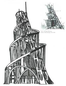
Tatlin's Tower


It is all made of wood, it reflects his harmony and liberation and it is also his most famous creation. I like the fact that it creates such an original and spiral shape. It looks as if there is some kind of stairs.

An Animated Video Of The Building Of Tatlin's Tower


Juan Antonio Avalos's Russian Constructivism in Fashion.


Its colours and shapes are really interesting. The colour red was really used in Constructivism. In his collection, he also made use of tracksuits which he converted them into military uniforms.


Varvara Stepanova


She was born in Lithuania in 1894. She refers to herself as a constructivist. She was a designer, painter and also a photographer.


Varvara's Works


Bibliography


http://www.kmtspace.com/tatlin-arch.htm
http://www.theartnewspaper.com/articles/A-centuryold-monument-highlights-Abu-Dhabis-ambition/25105
http://totallyhistory.com/vladimir-tatlin/
https://www.youtube.com/watch?v=ioen8sfARLc
http://www.literaryreview.co.uk/merridale_07_09.html
http://www.newsfashionweek.com/juan-antonio-valos-3/
http://historicallymodernquilts.blogspot.com/2013/07/modern-print-monday-varvara-stepanova.html
Notes taken during the lesson
http://www.designishistory.com/


Monday, April 21, 2014

History Of Art


Neo And Post Impressionism 


They cover the period around 1880 and 1910. They are developed out of Impressionism. The artists of Post Impressionism were Gauguin, Cezanne and Van Gogh. The artists of Neo Impressionism were Seurat and Signac. These artists had the expression of feelings and ideas. Their work revealed spiritual and personal direction. 

Post Impressionism


Paul Gauguin

Self Portrait- Les Miserable


Landscape with Three Trees


Paul Gauguin - Landscape with Three Trees

It shows a wonderful landscape with the use of contrastable colours. Although there are more than three trees, the artist focuses on only three of them. He does this by enlarging the three trees so that they are the main focus of the landscape.


Paul Cezanne
Self Portrait 


Jas De Buffan, The Pool


It's really interesting how he interprets the reflection of the flowers and the scenery into the pool. The bright colours used are creating an amazing effect and composition.


Vincent Van Gogh
Self Portrait


The Cafe La Nuit 

The Cafe la Nuit painted by van Gogh

The floor is created with brush strokes which happens to create such an interesting texture and pattern. There's also a sense of contrast due to the use of orange with blue. The title really reflects the work!


Neo Impressionism 

Jeff Seurat 
Self Portrait

seurat


A Sunday Afternoon on the Island of La Grande Jatte


This work is creating a calm effect due to the soft colours and textures shown. It's a typical scene from everyday life.


Paul Signac 
Self Portrait


File:Seurat Paul Signac.jpg


The Pink Cloud Antibes


the pink cloud antibes

This was done with a technique which is known as pointillism. There is use of primary colours which are really creating an amazing contrast and texture. The texture of the cloud looks really detailed due to the dark blue colour which is applied on the outline of the cloud.


Bibliography 

Notes taken during the lesson
http://www.mystudios.com/art/post/gauguin/gauguin-self-portrait-miserables-1888.html
Self Portrait: Les Miserables
1888
oil on canvas 45x55cm
Gauguin Museum

http://www.allpaintings.org/v/Post-Impressionism/Paul+Gauguin/Paul+Gauguin+-+Landscape+with+Three+Trees.jpg.html
http://www.ibiblio.org/wm/paint/auth/cezanne/portraits/self/self/
http://www.ibiblio.org/wm/paint/auth/cezanne/land/
http://entertainment.howstuffworks.com/arts/artwork/vincent-van-gogh-paintings-from-paris4.htm
http://www.dailymail.co.uk/travel/article-2010752/French-art-breaks-Ambling-footsteps-van-Gogh-Provence.html
Atmospheric: The Cafe la Nuit painted by van Gogh during his stay in Arles in 1888

http://www.jeffzischke.com/blog/?p=687
http://www.artble.com/artists/georges_seurat/paintings/a_sunday_afternoon_on_the_island_of_la_grande_jatte
http://en.wikipedia.org/wiki/File:Seurat_Paul_Signac.jpg
http://artmight.com/Artists/Paul-Signac/the-pink-cloud-antibes-53942p.html

History Of Design


Neo Gothic In Design


Oxford University

oxford university Oxford, England

It dates from the 12th Century. It has a use of different geometrical shapes which makes it look really interesting as a building. It has amazing forms and textures.


Slipper Chair by John H. Belter


This chair is really rich in texture which is done with the technique called carving. It has a fantastic detailed pattern. It has a sense of contrast both in material and both in colour due to the use of brown with blue and wood with silk.


Dining room by Alexander J. Davis


interior design: Gothic Revival dining room


Although it is made up of different patterned furniture and decorations, it happens to create an amazing composition. It is really rich in patterns and textures. 


Photography by Thom Kerr


Black Magazine Issue 17


This photograph is a perfect example of neo gothic due to its black and white colours, building and fashion used.


Topshop Spring/Summer Collection 2013
 by JW Anderson


The hair, clothes, patterns and shoes are all in black and white and so that is what makes them neo gothic. The design of the whole outfit is similar to the repetitive shapes of Alexander J. Davis's dining room's wall pattern.


Bibliography


http://paradiseintheworld.com/oxford-england/
http://www.metmuseum.org/toah/works-of-art/51.79.9
Slipper chair, 1850-60-John H.Belter (american, born Germany, 1804-1853; firm active New York City, 1844-66
http://www.britannica.com/EBchecked/media/35326/Social-and-economic-considerations-in-interior-design
http://www.trendhunter.com/trends/black-magazine-issue-17
http://fashion.telegraph.co.uk/galleries/TMG9847265/J.W.-Anderson-for-Topshop-springsummer-2013-collection.html


History Of Art


Impressionism

It began in the late 1860's with a group of friends named Monet, Pissarro, Sisley and Degas in France. They first exhibited in 1874. Impressionism shows an interesting effects of light in art. The artists painted en plain-air. Weather conditions and changes in light were one of their interests. Throughout their work, they all happen to make use of visible strokes and bright colours.

Claude Oscar Monet

Self Portrait With A Beret - Claude Oscar Monet - www.claudemonetgallery.org


Water Lily Pond Symphony In Rose

Water Lily Pond  Symphony In Rose - Claude Oscar Monet - www.claudemonetgallery.org

I like the use of colours, shapes and textures. It shows an interesting composition. I like how the bridge is being interpreted with the pond, roses and water lilies.


Camille Pissarro

Self Portait 1

Self Portrait I - Camille Pissarro - www.camille-pissarro.org


Snow Effect At Ergany, 1894


Snow Effect at Eragny, 1894 - Camille Pissarro - www.camille-pissarro.org

This work is a perfect meaning of the word Impressionism due to its bright colours and changes in light. There's also a use of contrast between the light colours of the trees and the grass.


Alfred Sisley

Portrait of Alfred Sisley


Regattas at Moseley 

The Regattas Moseley

The main focus of this work goes directly to the flags. Its different colour schemes makes it really interesting.


Edgar Degas

Self Portrait

degas self portrait new

Ballet Dancers In The Wings

File:Edgar Degas - Ballet Dancers in the Wings.jpg

I really like the composition of this work as it has a use of different blues which makes it really interesting. I like the fact that this work is showing movement and emotion.

Bibliography

Notes taken during the lesson
http://arthistory.about.com/od/impressionism/a/impressionism_10one.htm
http://www.claudemonetgallery.org/Self-Portrait-With-A-Beret.html
http://www.claudemonetgallery.org/Water-Lily-Pond--Symphony-In-Rose.html
http://www.camille-pissarro.org/Self-Portrait-I.html
http://www.camille-pissarro.org/Snow-Effect-at-Eragny,-1894.html
http://communicationvisually.wordpress.com/2011/09/13/self-portraits/
http://www.paintingmania.com/regattas-moseley-148_19420.html
http://commons.wikimedia.org/wiki/File:Edgar_Degas_-_Ballet_Dancers_in_the_Wings.jpg